
MY BLOGS
Hugo Blog
5th January 2013
9th January 2013
18th January 2013
7th February 2013
19th February 2013

29th March 2013

1st April 2013

15th April 2013

11th May 2013

6th June 2013

7th June 2013
17th June 2013

18th June 2013

20th June 2013
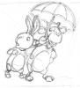
13 - My Working Rough of the Cover
18th June 2013
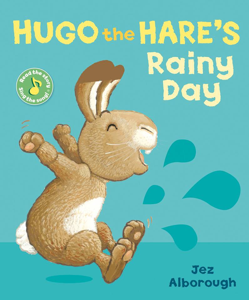
Just before I start the painting it's important to agree on what colours we will use in the typeface and the background. To do this the designer has used an earlier illustration of Hugo (from the first book) as a way to try colours out with the correct tonal range found on Hugo's body. We think this green looks quite good with Hugo's browns but as you'll see, the tone of green changed in the final version. The splashes also went and an umbrella was added as a colourful prop.
NEW ON THE SITE


HAVE YOU SEEN?
Click on the picture for the full-sized version
Click on the picture for the full-sized version
The Whole Range is Here!